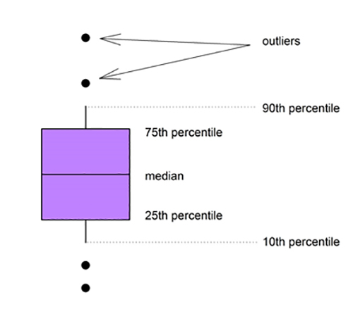
How to read a Box-and-Whisker-Plot
Box-and Whisker-Plots provide a summary of the distribution of data for each zone.
The line in the box shows the median (middle) value for the data. This is the value that is used to determine whether an indicator complies with a water quality objective.
The top and bottom of the box are the 25th and 75th percentiles, meaning that the middle 50% of data values fall within this range.
The whiskers (vertical lines) represent the 10th and 90th percentiles, showing the range of values for the middle 80% of the data.
The dots above the lines are outliers, i.e. individual data values that fall outside the 10th/90th percentile range.

Give feedback about this page.
Share this page:
URL copied!